Wednesday 19 December 2007

Truck Creation

After the exterior model of the barn, my next assigned task was to build the truck. The initial idea was to have a really old, rusty truck to fit in with the farm environment. We wanted to go with a old fashioned vintage look. The image below is the original inspiration for the truck.


Early during the modelling stage however, it became evident that it wasn't turning out very well. I wasn't happy with the way it was going, as it didn't come across as enough of rickety old banger. the problem was that it had too low a ground clearance, which actually made it look quite stable. Also, with the current model (below), I knew there would be problems with the 'jiggle' dynamics brought about by the vehicle's aging suspension. The wheels were simple too close to the frame which would mean that if the car 'jiggled', the wheels would hit or worse, pass through the frame. The whole thing needed to be higher.


Enter old rusty rickety truck mark II (below). This new design deviates from the original picture, however is more practical and just generally more aesthetically pleasing as a model. It resembles an old military transport truck more than the original image, although I kept the front as I wanted to keep to the whole vintage look. The body no had a higher ground clearance, and the wheels had enough space for the body to bounce around when the truck is in motion. The cage as the back would also be jiggle around while the truck's moving.

The image below is a more developed version. Luke pointed out that with the previous model (above), the underside looked empty and needed something to fill in the space. My original intention was to occupy that space with random components, such as pipes, oil tanks, tubes, etc. However, Luke recomended that I should just have the same design on the front on the back end as well. I think this actually looks better than having random machinery at the botom. This was done literally by duplicating the body, flipping it around 180 degrees, then cutting and merging it into place. This gives the truck a more solid body and also avoids me putting in uneccessary detail on the underside.

I also applied an ambient occlusion map on the model by baking out a light map and applying it as a texture. This just gives me a rough idea of what it'll look once AO has been applied. Texturing-wise, it's also very handy as it shows you exactly which parts of the mesh is elevated and which parts are sunken, making it easier to paint in shadows and details like scratches and such.

This next image is a partially textured version of the truck. This is still under heavy construction in terms of texture design. I knew I was going for the brown and rusty look, but at this stage I was still messing about with actual details on the texture such as bolts, metal plates, etc.

Originally, the truck was split into four UV sets, each taking up its own quadrant in the texture editor. My reasoning for this was that in order for the truck to have as much detail and definition, each texture would have to be massive. It was originally 4 x (2048 x 2048). This of course is massive, plus I was unhappy with the way I'd mapped the whole thing as I was getting some really ugly seams at very exposed areas. It was simply more work to try and hide them, than to simply re-map the whole thing. This actually didn't take too long to do, and once the UV sets were layed out, I now only had two UV sets. One was for the body, cage, and cavas cover, which was a 2048 texture, and the other was for all the random bits and pieces on the underside of the truck such as wheels, drive shafts, mudflaps etc. This latter texture was only a 1024 x 1024. Although you can clearly see the difference in quality between the two texture sizes, once it was rendered with a bit of lighting, this actually became less and less noticable. Even more so if the truck is animated.

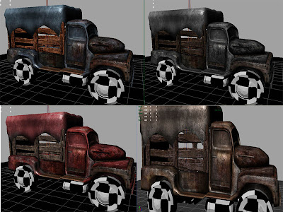
These four images were experiments of the different colours scheme of the truck. The differences aren't very definable in this picture, but they are blue, red, brown, and grey. This was Luke's idea, as aparently the orginal one was too brown and needed more colour. The cheek! He said he wanted it to be more red. After some faffing around in Photoshop, I came up with a mock up to which he said "hmmmm....nah actually I rather like that first one you did to be honest". Aparently it was too red. Back to the original brown it is. That said, I realised that it wasn't actually the red that made it too agressive, it was the amount of rust and grunge detail that I'd put on the texture. There was so much rust that it already looked as if it was going to crumble into dust any second, so I toned it down sinificantly, and adjusted the contrast levels in Photoshop to make it slightly lighter.

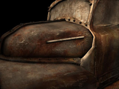
This is a displacement map test I was playing around with. If you can't tell, it's the bolts and that long metal bar thing sticking out of the bonnet that's been displaced. Otherwise the whole thing is just texture. I abandoned the idea of using Displacement Maps since I thought that the truck's only going to be featured in the opening scene, and even then you'll never actually be close enough to notice any displacement. It would've therefore been a waste of time, and would have bumped up rendering time that little bit more, so I'm sticking to the modest bump map for this one. With Specular too of course.

This is a 'test render' of the fully textured version. The underside is still unfinished at this stage, plus the windows need some alpha maps for transparency. I just wanted to see how it'd look under a production quality render with mental ray. This took roughly 20-25 seconds, which isn't too bad considering the opening scene is only going to be so many frames.

There is something which really drove me crazy about this, and that's the quality of the render. For some reason, it looks infinitely more clear and crisp under hardware render in the viewport, than with actual mental ray itself. Mental ray seems to to blur out the texture unless the camera's literally right next to the model. After tweaking every setting in mental ray and yielding very little results, I gave up.....

.....or did I?! The image below if the fully finished version (minus rigging and dynamics). As you can see, it's definitely much more crisp and sharp than the mental ray version. This image also has an AO pass over it set at multiply. However, the sharpness wasn't achieved with the mighty mental ray, but with the ever humble and user friendly Adobe Photoshop. Basically what I'll just have to do is create an Action in Photohsop which will in turn apply the same filter to every frame of the render. Sorted!

This is a quick dynamics test I did. It utilises a very simple rig; the crate is attached to the main body, and the main body is in turn attached to the underside frame, therefore, once in motion, if the underside stops abruptly, the main body jerks forward and jiggles, and the cage in turn jerks and jiggles. The jiggle effect is done through the use of hair follicles attached to the rig.

This is basically ready for use in the scene. If needs be, it can be tweaked very easily.

Saturday 15 December 2007

Environment Design (Buildings - Barn)

During the animating stage, since I wasn't assigned to work on the animatic, and since I'd already done my share of the concept work, Luke gave me the go-ahead to start on the barn. the look and style of the barn was already agreed so there was little or no changes to be expected in the design.


This is the first mock up of the barn. The shape and design were final, but the placement of the assets such as pipes and other details were left to my own creative design. The over-all look is still loyal to the initial concept, which was an old ricktety structure of wood, but augmented heavily with rusty pipes and machinery. My personal view on the barn, was that it's a place of evil and death. I wanted to convey a sense of uneasiness and anxiety upon seeing it which is why I incorporated the heavy machinery. In effect, it's fuction is more of a factory rather than a chicken coop.

With regards to polycount and detail, I allowed myself to break free of my usual 'low-poly' style of modelling. The barn will only be in the opening scene, and even then, will only be in view for a few seconds, thus rendering it won't compose of too many frames. The structure itself is still very low-poly, but the roundness and complex shapes of the pipes demanded higher poly counts in order to maintain their shape without becoming blocky or jagged. True to the low-poly modeller's maxim, I'd normally compensate this jaggy-ness with some good texturing, but in this case it's not necessary to do so.


This is a textured version of the barn, not yet employing the use of bump or specular maps. I created the textures in photoshop, using multiple layers of stock textures and editing them as necessary. Due to its size, my main concern that the texture would look stretched and blurry with a 1024 x 1024 texture. True enough it did, and so I bumped it up to 4096 x 4096. This is massive, I know, which is gonna kill me come render time. Another problem was that in order for the UV sets to have as much pixels as posible, I used not one, but 4 texture maps, each in their own separate quadrants. That's 4 quadrants of 4096 x 4096 textures!!! And that's just for the colour map. Including bump and specular maps, that's three 4096's for every quadrant!!!


This is a test render set on 'preview' quality. It took around a minute, which isn't too bad considering the amount of detail in the scene. Render-wise, it's still feasable, and I can always down-size the textures if worst comes to worst. At present, it doesn't seem necessary.


This is actually the very first piece of the barn which I textured. It's a 2048 x 2048 texture, but I think this can be brought down to 1048 and still retain its quality. It's just an asset anyway. Probably wondering what the hell it is huh? I'm not really sure, but I designed it as a tank containing toxins and other noxious liquids which are pumped into the barn for whatever reason. I just wanted to give the barn a 'factory' look, like a chemical plant. Whatever it is, it's supposed to imply that whatever's going on in that barn is not good. The text on the side says "Killer Carbide", from the Bhopal incident involving a leak at a chemical plant. It just sounded cool and evil and stuff.

These next two images, are higher quality render's. As honor demands, I must admit that I didn't light the scene. Lighting is courtesy of Ajdin Brujca from 2nd year. The backgrounds of course are fake. The scenery and grass were done in photoshop. I wanted to see what the barn would look like within context so i grabbed some images from google and wove them into the scene, then applied a 'warm' photo-filter to the whole thing to achieve cheap sunset lighting. Fairly happy with the over-all look, but needs more tweaking naturally.


The following images are from the interior of the barn. I started working on these because there wasn't anything for me to do at the time, but was reproached for speeding ahead. My orders were to 'slow down', and I was re-allocated to helping with more immediate work for the presentation. Stuff which should've been finished weeks ago by people who were charged with doing them, but aren't due to certain persons not pulling their weight!

Anyway, the design of the coop are loosely based on the original concept. I say 'loosely' since the original concept was never finalised, which meant that interpretation of the interior's design was once again left to my personal creativity. My idea was to make it look as uncomfortable as possible. The first thing that I thought of was a prison block, hence the multiple levels. I also wanted to look like a production line, which is what it basically was anyway. The initial idea was that each cage was like a prison cell, with a hole in the centre. The chickens would sit over the hole, and lay eggs which would fall down and roll on to a conveyor belt which transported them to a big collection machine at the back. That's the thing that currently looks like a giant fire-hydrant. That's not final of course. Mainly, i was just trying to establish the layout and overall feel. This scenery is therefore still subject to heavy change. However, what is shown here is where I left off. This scene is now being continued by Luke and Samir, but will be sent back to me for texturing.

A word on polycount. Thus far, this has been a low-poly modeller's nightmare. It simply couldn't be done in low poly without sacrificing detail and definition. The bars on the cage themselves, being cylinders, demanded a hefty 20 polygons each! The poly count for the scene is hovering around a quarter of a million. That said, it can still be cut down of course. With regards to the bars, the only solution I can think of is to have the main chicken's cell composed of actual polygons, while the bars on all the other coops will simply be single plane poly's with alpha mapping. Hopefully they should be unnoticable enough from the distance, since the main focus will be on the chicken anyway. The dark lighting should also help hide any cheapness to the scene.


Saturday 27 October 2007

More Chicken Concepts

The image above is Luke's design of the cockrell, coloured and textured by yours truly (naturally). What I like about this design compared to mine is that is actually bears resemblance to the chicken before it turns into a cockrell, which I think gives it a sense of continuity. My only criticism is that it doesn't look 'macho' enough.


The Images above and below were my designs for how the chicken would look during the egg robbery scene. There were mixed opinions as to which was best. Most of the other students I asked seem to prefer the 'Splinter Cell' look (Bottom), where as the tutors seems to prefer the more traditional robber look (Above). At the moment, we'd decided to go with the latter as it seems to fit in more with the look that we're aiming for. Also, we realised that not everyone will recognise the Splinter Cell outfit and so won't fully apreciate the connection.


All the images below were all coloured in Photoshop.


The fat hens above are colour variants of a 'veteran' hen who will feature in the barn scene. She'll be laying eggs at a rapid rate, making the main character even more anxious t lay an egg. These were pencil drawn by Luke, which I then coloured in Photoshop. Same with the next two images below.

These are the designs for the other hens in the barn. We're planning to have one or two more variants which will be duplicated throughout the hatchery.


I decided to add the shelf and cubicles in photoshop to give the concept more of a context. The shelf designs however, do not reflect the final design or layout of the barn.


These are my design for the possible look of the farmer. We originally decided not to actually feature the farmer, but to just be a silhoutte in the background as a means of building up the tension. However, a change in the animatic means he'll be brought back in the picture, to actually make an appearance at the beggining. The images above are my personal designs on the farmer's body. The ones below are obviously designs on his actual appearance. The previous farmer designs were aparently too graphic and 'heavy' looking, so i decided to tone down the muscle and brutality. When Luke asked me to create some more designs, I imediately invisioned four different types. There's was the tall and skinny, the muscular and powerful, the fat and slow, and the old and creepy.


Everyone seems to favour the whole old and skinny and huchbacked design. I'm fine with it, but personally I don't find it imposing or intimidating enough. I believe the farmer needs to instill fear and terror. However this would be 'inappropriate' in a happy family film! (>.<)


With regarsd to the heads, there were three main designs; the bulbous and mutated, the cruel and menacing (yes I know! The 2nd one is basically woverine from X-Men!), and finally the old and wrinkled.


These images below are my personal take on what the final cockrell might look like. We are still generally leaning towards Luke's first design, but I thought it was definitely worth exploring other designs so we'd have something to compare the first one with.

I personally wanted the cockrell to be much bigger and more well built than Luke's design. The way I saw it was that it would be more of a transformation to go from the skinny weakling that the chicken was, into a big muscly, powerful cockrell. However, i'm not sure if I went a little too far. Afterall, he's only turning into a cockrell, not the incredible Hulk. Still....food for thought eh?


Thursday 18 October 2007

Scrapped Concepts

These were actually done earlier in the week, but I hadn't had a chance to scan them in till recently.

These were the initial concepts for the farmer who was to be seen taking the chicken from the truck and putting him into the barn, as well as taking the chicken to the abatoire towards the end of the story. The original idea was that the farmer would only be seen from the chest or shoulder down. His face was never to be revealed. We had this idea in order to make him more menacing and mysterious. The drawback was that facial expressions are a significant part of character, meaning that we would be limited to showing the farmer's character through body movements alone. Since we are deprived of his face, I sought to compensate by giving him a more distinguishing body. Already I had an image of the farmer being lumbering chunk of meat, wether through fat or muscle. With regards to attire, I imagined him wearing very simple clothing, such as a butcher's apron, or dungarees. Giving him a cleaver or machete to wield made him more menacing and gave him a sense of brutality. In fact, my main source of influence was 'Pyramid Head' from Silent Hill, but I was reproached for making him too graphic. Aparently this 'inappropriate' for the 'happy ending'. Whatever.


One of my ideas (bottom left corner), was to have him wearing a necklace of chicken skulls, but again, this was considered too graphic. (@_@)


Although I said, the farmer's face was never actually to be seen, these were just to give us an idea, of what he may look like, and so help us with his attitude and personality.
The design in the middle (dungarees and cleaver), was to be the chosen design. However, due to the changes in the story (see previous post), the farmer has been scrapped and will no longer make an appearance. Censorship.

These are the concept sketches for the truck which was to feature in the openning scene, transporting the chicken to the farm. Again, because of the changes to the story, the truck will now simply feature as part of the scenery on the farm.

This was to be the chosen design for the truck.
It was vector-rendered in maya to get the outlines, then coloured in Photoshop.

Changes To The Story

This week was mainly spent discussing and developing the story further. After numerous heated debates, it was decided that the beginning sequence, which showed how the chicken arrived at the farm, was to be scrapped as it was not essential to the story, and took up too much valuable time.
The story now begins straight at the farm, specifically in the barn where much of the focus will be. We'd decided to allocate more time to the barn scene as this is the most important part of the story, involving various gags and jokes, as well as where the main narrative actually takes place.
The ending has also been changed. Originally the chicken was to be taken away by the farmer who is seen walking towards the abatoire, implying the chicken's fate. However, as was aparent throughout the pitching stage, it seems that only 'happy endings' will be accepted in this project. Therefore, it was decided that the chicken will instead find its true calling once it realises it is a cockrel, and reside in the barn in blisfull happiness with all the hens to himself. He will also be shown throughout the credits in various states of pampering, i.e. being fed, fanned etc. Hopefully this should suffice as a typical 'happy ending'.

The process of storyboarding has also begun, with Gary and Samir working in joint unison seeing as they will be our animators. Ian has agreed to concept assets, while I volunteered to take care of general concepts, i.e. character, interior and exterior designs. Luke as director will oversee the overall workflow, as well as lending his help where it is needed. He has also began creating and organising a production pipeline to help keep us within schedule.

Wednesday 10 October 2007

Initial Concept Work

These are the initial concept sketches from Luke. I coloured them in Photoshop CS2. Shown here, is the Chicken, and also the barn which will feature in the story. There are not the final products, but are only there to give us a rough idea of what the final look could be.


These are the coloured versions which is did in Photoshop.


One of our issues regarding the chicken, was wether to give him actual feathers, as in polygons. This however could present some serious problems as dynamics can sometimes be volatile and unpredictable. It was suggested that the chicken would just be textured to look feathered. Shown above is my attempt.

I made the door smaller to give the barn a larger scale. I also removed the stilts as it seemed a bit silly that a building this size would be on stilts.

I wanted to give the barn a dark and menacing look, hence the use of dark colours, and old or decaying textures.


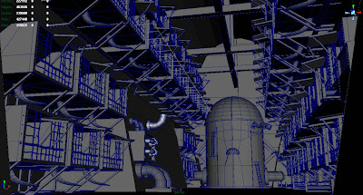
This is a version that was quickly modelled in Maya then vector rendered to get the outlines. It was then coloured in Photoshop. This was an experiment to see wether this method could produce much quicker results than drawing it by hand, and scanning it in. While it does work, the quality of the lines are not as crisp, and it involves alot of cleaning up before it is workable. This method does save time when drawing complex perspective angles, but pencil drawings seem to produce cleaner results.

Development of Story

Yesterday we went through the story, looking at the finer aspects. We discussed what the actual meaning or message of the story was, which we concluded seemed to be about maturity, and the desire to fit in. Throughout the journey the Chicken slowly realises that the world isn't as happy and pleasant as it seems, that it has a dark and ugly side. This is similar to a small child's transformation into adulthood, becoming aware of the grim realities of life. The Chicken's vigorous efforts to lay an egg shows its desire to fit in with the rest and not stand out. As it is said "the nail that sticks out gets hammered", and this is reflected by the chicken's fear of being noticed as different.

We also went through each scene, and discussed their relevance to the story. Several scenes were changed, or taken out completely as we believed that they weren't significant to the story. We didn't focus too much on specifics such as camera work, or lighting, since this will be iscussed during the story boarding period.

In the end, the original story had been disected and reformed into a more solid script, however, further development is needed.

With regards to the group's ability to function, so far everything has been smooth. Everyone contributed ideas as well as criticisms, and bar a few conflicts of opinion regarding certain scenes, has generally worked well, with cricisms being accepted and taken into account before discussing how it can be solved. So far so good!