This is the first mock up of the barn. The shape and design were final, but the placement of the assets such as pipes and other details were left to my own creative design. The over-all look is still loyal to the initial concept, which was an old ricktety structure of wood, but augmented heavily with rusty pipes and machinery. My personal view on the barn, was that it's a place of evil and death. I wanted to convey a sense of uneasiness and anxiety upon seeing it which is why I incorporated the heavy machinery. In effect, it's fuction is more of a factory rather than a chicken coop.
With regards to polycount and detail, I allowed myself to break free of my usual 'low-poly' style of modelling. The barn will only be in the opening scene, and even then, will only be in view for a few seconds, thus rendering it won't compose of too many frames. The structure itself is still very low-poly, but the roundness and complex shapes of the pipes demanded higher poly counts in order to maintain their shape without becoming blocky or jagged. True to the low-poly modeller's maxim, I'd normally compensate this jaggy-ness with some good texturing, but in this case it's not necessary to do so.

This is a textured version of the barn, not yet employing the use of bump or specular maps. I created the textures in photoshop, using multiple layers of stock textures and editing them as necessary. Due to its size, my main concern that the texture would look stretched and blurry with a 1024 x 1024 texture. True enough it did, and so I bumped it up to 4096 x 4096. This is massive, I know, which is gonna kill me come render time. Another problem was that in order for the UV sets to have as much pixels as posible, I used not one, but 4 texture maps, each in their own separate quadrants. That's 4 quadrants of 4096 x 4096 textures!!! And that's just for the colour map. Including bump and specular maps, that's three 4096's for every quadrant!!!
This is a test render set on 'preview' quality. It took around a minute, which isn't too bad considering the amount of detail in the scene. Render-wise, it's still feasable, and I can always down-size the textures if worst comes to worst. At present, it doesn't seem necessary.
This is actually the very first piece of the barn which I textured. It's a 2048 x 2048 texture, but I think this can be brought down to 1048 and still retain its quality. It's just an asset anyway. Probably wondering what the hell it is huh? I'm not really sure, but I designed it as a tank containing toxins and other noxious liquids which are pumped into the barn for whatever reason. I just wanted to give the barn a 'factory' look, like a chemical plant. Whatever it is, it's supposed to imply that whatever's going on in that barn is not good. The text on the side says "Killer Carbide", from the Bhopal incident involving a leak at a chemical plant. It just sounded cool and evil and stuff.
These next two images, are higher quality render's. As honor demands, I must admit that I didn't light the scene. Lighting is courtesy of Ajdin Brujca from 2nd year. The backgrounds of course are fake. The scenery and grass were done in photoshop. I wanted to see what the barn would look like within context so i grabbed some images from google and wove them into the scene, then applied a 'warm' photo-filter to the whole thing to achieve cheap sunset lighting. Fairly happy with the over-all look, but needs more tweaking naturally.

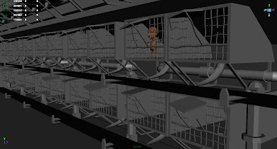
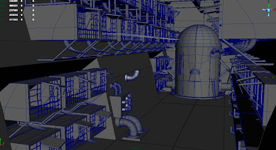
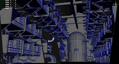
The following images are from the interior of the barn. I started working on these because there wasn't anything for me to do at the time, but was reproached for speeding ahead. My orders were to 'slow down', and I was re-allocated to helping with more immediate work for the presentation. Stuff which should've been finished weeks ago by people who were charged with doing them, but aren't due to certain persons not pulling their weight!
Anyway, the design of the coop are loosely based on the original concept. I say 'loosely' since the original concept was never finalised, which meant that interpretation of the interior's design was once again left to my personal creativity. My idea was to make it look as uncomfortable as possible. The first thing that I thought of was a prison block, hence the multiple levels. I also wanted to look like a production line, which is what it basically was anyway. The initial idea was that each cage was like a prison cell, with a hole in the centre. The chickens would sit over the hole, and lay eggs which would fall down and roll on to a conveyor belt which transported them to a big collection machine at the back. That's the thing that currently looks like a giant fire-hydrant. That's not final of course. Mainly, i was just trying to establish the layout and overall feel. This scenery is therefore still subject to heavy change. However, what is shown here is where I left off. This scene is now being continued by Luke and Samir, but will be sent back to me for texturing.
A word on polycount. Thus far, this has been a low-poly modeller's nightmare. It simply couldn't be done in low poly without sacrificing detail and definition. The bars on the cage themselves, being cylinders, demanded a hefty 20 polygons each! The poly count for the scene is hovering around a quarter of a million. That said, it can still be cut down of course. With regards to the bars, the only solution I can think of is to have the main chicken's cell composed of actual polygons, while the bars on all the other coops will simply be single plane poly's with alpha mapping. Hopefully they should be unnoticable enough from the distance, since the main focus will be on the chicken anyway. The dark lighting should also help hide any cheapness to the scene.


No comments:
Post a Comment