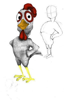
 The image above is Luke's design of the cockrell, coloured and textured by yours truly (naturally). What I like about this design compared to mine is that is actually bears resemblance to the chicken before it turns into a cockrell, which I think gives it a sense of continuity. My only criticism is that it doesn't look 'macho' enough.
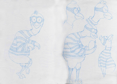
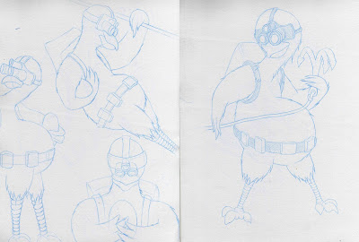
The Images above and below were my designs for how the chicken would look during the egg robbery scene. There were mixed opinions as to which was best. Most of the other students I asked seem to prefer the 'Splinter Cell' look (Bottom), where as the tutors seems to prefer the more traditional robber look (Above). At the moment, we'd decided to go with the latter as it seems to fit in more with the look that we're aiming for. Also, we realised that not everyone will recognise the Splinter Cell outfit and so won't fully apreciate the connection.
All the images below were all coloured in Photoshop.


The fat hens above are colour variants of a 'veteran' hen who will feature in the barn scene. She'll be laying eggs at a rapid rate, making the main character even more anxious t lay an egg. These were pencil drawn by Luke, which I then coloured in Photoshop. Same with the next two images below. These are the designs for the other hens in the barn. We're planning to have one or two more variants which will be duplicated throughout the hatchery.
I decided to add the shelf and cubicles in photoshop to give the concept more of a context. The shelf designs however, do not reflect the final design or layout of the barn.

These are my design for the possible look of the farmer. We originally decided not to actually feature the farmer, but to just be a silhoutte in the background as a means of building up the tension. However, a change in the animatic means he'll be brought back in the picture, to actually make an appearance at the beggining. The images above are my personal designs on the farmer's body. The ones below are obviously designs on his actual appearance. The previous farmer designs were aparently too graphic and 'heavy' looking, so i decided to tone down the muscle and brutality. When Luke asked me to create some more designs, I imediately invisioned four different types. There's was the tall and skinny, the muscular and powerful, the fat and slow, and the old and creepy.
Everyone seems to favour the whole old and skinny and huchbacked design. I'm fine with it, but personally I don't find it imposing or intimidating enough. I believe the farmer needs to instill fear and terror. However this would be 'inappropriate' in a happy family film! (>.<)
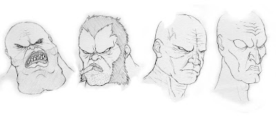
With regarsd to the heads, there were three main designs; the bulbous and mutated, the cruel and menacing (yes I know! The 2nd one is basically woverine from X-Men!), and finally the old and wrinkled.
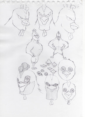
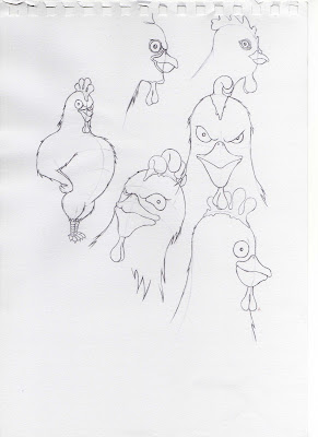
These images below are my personal take on what the final cockrell might look like. We are still generally leaning towards Luke's first design, but I thought it was definitely worth exploring other designs so we'd have something to compare the first one with.
I personally wanted the cockrell to be much bigger and more well built than Luke's design. The way I saw it was that it would be more of a transformation to go from the skinny weakling that the chicken was, into a big muscly, powerful cockrell. However, i'm not sure if I went a little too far. Afterall, he's only turning into a cockrell, not the incredible Hulk. Still....food for thought eh?

No comments:
Post a Comment